
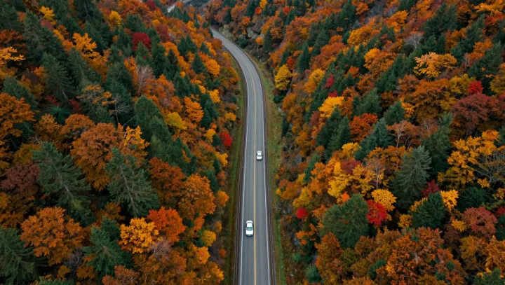
One aerial frame beats a whole atlas. A lone highway, seen from above in autumn, does more than trace a route; it acts as a live sensor array, folding traffic speed, vegetation health and even moisture gradients into a single field of color and motion.
Maps pretend to be neutral, yet they freeze intent rather than reality. A printed highway line encodes design speed and jurisdiction; an autumn photograph shows actual flow, lane by lane, through headlight streaks, platooning gaps and congestion waves that traffic engineers model with queuing theory and fluid dynamics. Where the printed symbol treats the forest as a flat green polygon, the aerial view reveals biomass gradients and canopy stratification: dark, dense conifers, thin deciduous stands, clear-cuts, all acting as a rough proxy for leaf area index and even soil compaction.
More surprising is how much weather sits in those reds and golds. Color shifts mark phenology, the timing of leaf senescence that tracks local temperature, evapotranspiration and cold-air pooling. Frost pockets show up as premature browning along low swales; warmer asphalt radiates as delayed color near interchanges. Without a single contour line, the image hints at boundary-layer turbulence, wind exposure, even pollution corridors where exhaust subtly discolors downwind crowns. What the map states in symbols, the photograph whispers in gradients, and the eye decodes it in an instant.