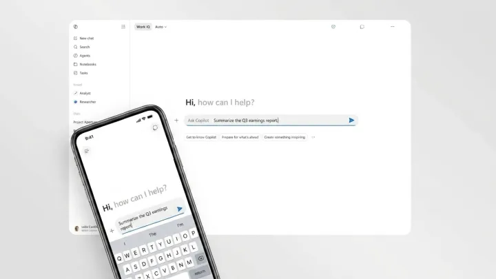
Copilot now looks less like a chatty sidekick and more like a corporate product line. The assistant’s new interface tightens colors, typography, and iconography into a single, stripped‑back visual system that stretches across Windows, the web, and mobile apps, signaling that Copilot is no longer an experiment tucked into side panels.
This shift is not cosmetic; it is positioning. By muting characterful animations and quirky UI moments, Microsoft is steering Copilot toward the same visual discipline it once reserved for Office and Azure, betting that compliance officers and procurement teams trust subdued design more than playful flourishes. The refreshed layout favors flatter surfaces, clearer hierarchy, and standardized controls, reducing the sense that each Copilot entry point is a separate personality and framing it instead as one coherent service layer.
There is a trade. A more uniform shell risks making Copilot feel generic just as rival assistants lean into distinctive voices and visual cues. Yet Microsoft appears comfortable letting large language model behavior carry the sense of intelligence while the frame around it retreats. On screen, Copilot now behaves less like a mascot and more like infrastructure, which is exactly how Microsoft wants buyers to see it.