
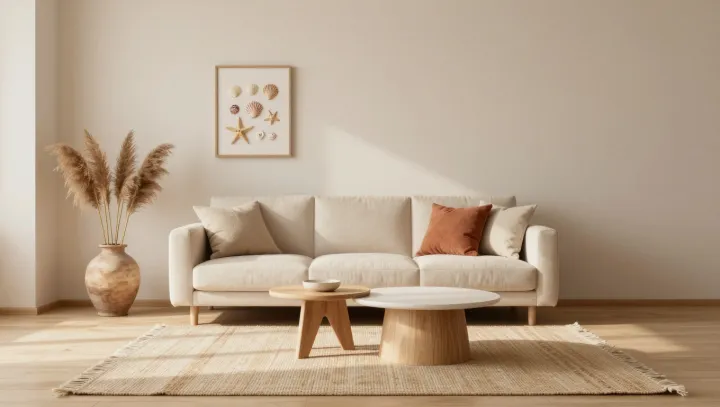
Beige wins the space race. Not because it is pretty, but because it controls what your eye has to process at once, turning a living room into a low‑noise field where volume, not color, does the talking. When saturation drops, the brain’s visual cortex stops chasing contrast edges and shifts to reading proportion, shadow, and distance, which are the real drivers of perceived room size.
Calm here is engineered, not accidental. A restricted beige palette acts like a visual low‑pass filter, cutting high‑frequency color signals so luminance and form dominate. Layered materials—bouclé, open‑pore wood, matte plaster—introduce micro‑contrast in texture rather than hue, giving the somatosensory system cues of richness without triggering the cognitive load that comes from competing colors and patterns scattered across the field of view.
Negative space does the heavy lifting. Empty wall stretches, a sofa pulled off the wall, a coffee table with air beneath it, all increase visible floor area and uninterrupted sightlines, which psychophysics links directly to perceived volume. Light then seals the effect. Soft, indirect lighting with high color rendering index keeps beige from reading flat, while grazing beams across textured surfaces exaggerate depth. The result is a room that feels both larger and slower, not because nothing is happening, but because everything is happening in a single, controlled register.