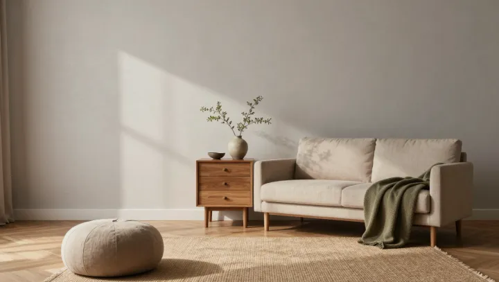
Quiet walls do more neurological work than any scented candle. A pared‑back living room, with a small cluster of soft surfaces and restrained color, feeds the visual system less raw data, so the brain’s visual cortex spends less metabolic energy sorting edges, contrast and depth cues.
The core claim from designers that “less is more” is not aesthetic poetry; it is an ergonomic statement about perception. Each object, pattern and hue adds to what cognitive scientists call information density, which drives up cognitive load and taxes working memory. When a room holds only a few pieces, and those pieces share similar tones and textures, the visual scene becomes easier to encode, compress and store. Functional MRI studies of visual attention show reduced activation in clutter‑free scenes, mirroring the way a processor idles when background processes are killed.
What feels like serenity is, in practice, a lightened sensory budget. Fewer stimuli mean less attentional switching, lower levels of neural noise and slower depletion of executive resources. Soft textiles scattered across hard architectural lines blunt high‑contrast boundaries, trimming the micro‑decisions your visual system would otherwise make every second. In that restrained field, the living room stops arguing with your senses and starts giving them back their bandwidth.